Tuesday, August 5, 2014

Color - Part One. Or why do you want those fries?

Whether you work with silver, gold, platinum or base metals, at one point or another, most of us want to find ways to add color to our work.

Whether you add color using gemstones, found objects, enamel, or flame painting, the colors you work with can help grab attention just as much or more than an amazing sparkling diamond.

Color is one of the most impactful visual techniques that can be used in the design of an object. Color is visceral, emotional, psychological and symbolic. Like our sense of smell, color is directly linked to memory, and just a glimpse of a color you like or dislike can subliminally make your decision about whether to ignore it, touch it, desire it or buy it.

Those (like me) who work as visual designers know how powerful color is. We use it when we design packaging, advertising, logos, websites and product design. And because color effects your brain on its own with no conscious help from you - the colors you see do lots of things to your brain that you might not be aware of.

Choosing colors is important not only for the work we make as artists, but also for our visual identities (our brands), what we use to package our items and even the text colors we use in our newsletters, emails and other correspondence to our customers.

So lets learn about some popular colors and see what's behind them - other than their obvious attractive hues.


lsueszabo    /    CynthiaDelGiudice

Lets look at red first. 

Steeped in history the primary color red symbolizes many things. Red means power. Red means life. Red means passion and love, but ironically, also fear and anger. Seeing red stimulates the adrenal glands and tells your brain that its time to pay attention because it might be time to move.

Red is the most aggressive of colors, it grabs our attention and can easily be overwhelming. But because red is also the color that most stimulates our senses it therefore can be used effectively to entice someone to do something… STOP for instance. And it can grab the attention of a buyer and draw people in for a closer look. And if you have ever suddenly felt hungry and didn't know why - look around you… red is widely used in the food industry to make people hungry - and unfortunately crave foods that might not be good for us.


MicheleGradyDesigns     /     markasky

Sunny Yellow


Who can see the color yellow and not think of the sun? This color just exudes brightness, sun-shiny happiness and warmth. Like red it is another attention grabbing, high visibility color, often used for signage on the road and in storefronts. When we see bright yellow we instantly pay attention, it is a commanding color that is very hard to ignore. In fact it is the color that attracts our attention more than any other. (which is why school buses and warning signs happen to be yellow) When we view softer, richer, golden colors we often feel comforted and warm.


fentondesign     /      mkwind

Heavenly Blue


If you have ever gazed upwards you can imagine why blue is a color that has been used throughout history to represent the heavens and the skyworld. Because of that connection it is widely associated with religion and also superstition. It is believed to be a protective color, and is still often used for talismans. Here in the northeast United States where I am from many people paint the ceiling of their farmers porches blue… it keeps away witches they say. But blue is contradictory in some ways too. It can mean quality and skill - think "Blue Ribbon" but also sadness and depression as in "having the blues". In the corporate world dark blues are used often as it immediately shows conservative dependability, seriousness, high quality and high achievement. Lighter blues are often used to evoke calm and peace. Fun fact - blue is one of the only colors that dogs see vividly.


2Roses  /  hybridhandmade

The Lushness of Green


Green is one of those colors that is just immediately associated with the outside world. I wrote an entire blog post about green, and how the definition has changed recently to mean "eco-friendly" and while that can't be ignored I'm going to focus on the original connotations. There is so much green out there - beyond your windows - green is just simply one of the most natural colors there is. It is also the most soothing color to our eyes. Green tells our brain that something is natural, lush, fresh and clean. It represents emergence, regeneration, and health. Green just feels "good for you" - ask any kid with peas or spinach on their plates to confirm that one.

Of course there are millions of colors that fall into and out of the above categories. Purples, oranges, earth tones, neons, and pastels… they are really endless. This is just a start.

Whether you care about color meanings or just want to design a piece around a sparkling gem that you love, experimenting with color in your work can be fun, and can certainly grab the attention of gallery shoppers if you use it well.


Resources to learn more:

COLOR: Messages and meanings - Leatrice Eiseman
COLORS: What they mean and how to make them - Anne Varichon
Guide to Communicating with color - Leatrice Eiseman

Saturday, August 2, 2014

What's New!

I found a few etsymetal team members this week who are hard at work in their studios rather than taking a mid summer break at the beach, cabin, or the inlaw's...

 Cynthia Del Giudice                                             2Roses


 AmityJewelry                                                      lsueszabo


 Prox                                                   Panicmama Jewelry


                    Form and Funktion                                    Fenton Design                                


 SCJJewelryDesign                                           simplyMegA
  

 JazznJewelry                                     Victoria Takahashi

ETSYMETAL Jewelry Challenge: Project Runway Season 13.1 REVEAL "The Judges Decide"


ETSYMETAL Jewelry Challenge: Project Runway Season 13.1 REVEAL:  "The Judges Decide"

Cynthia Del Guidice "Rose Bouquet Necklace"
Welcome to the reveal of last weeks' Episode 1

"The Judges Decide"
 
The Project Runway challenge: With one outfit, give the judges a glimpse of a hypothetical spring collection. Designers must choose from an assortment of 5 fabrics provided to them at the start of the challenge. *My Lifetime video here*

The EtsyMetal Translation: We asked our EtsyMetal team members to create a piece of jewelry out of one or five of the themes: "Rain, Birds, Five, Ombre & Growth."

And here are our 7 team members and 2 guest submissions reveal!


Copper with torch fired enamels. "This bird necklace is inspired by the story of Demeter and Persephone from the book - Lost Goddesses of Early Greece - A Collection of Pre-hellenic Greek Myths by Charlene Spretnak. I have just learned how to use decals with enamel and on the front I have added birds or parts of birds and on the back are the words - Leaves & Vines, Flowers & Grass, Grew into Fullness, Faded into Decay, Began Again."
"Growth is something I work on daily to expand skills, be a better parent to my kids, more understanding partner and better human being. Even though I don't always succeed, I constantly try. I made this piece to show that growth happens sometimes slowly (the dendrite limestone forms over longer periods of time), but often is "golden" when it is growth in the right direction. Sterling Silver, 22 karat.
Anna Severin Bird ring
Sterling Silver, Oxidized.
 
Honey Comb Necklace. "For this piece I chose to use the ingredients "ombre" and "growth" to create this statement piece consisting of connecting hexagons. Hand cut copper, vitreous enamel, sterling silver, gunmetal steel and brass bee charm."
 
"I chose 5 & growth. This is a pin. Enamel on copper and silver.
"I chose "Five". I made long shoulder duster earrings from brass and sterling to go with my favorite of the top 3 outfits this week. I put a pattern similar to the one in the skirt onto the earrings." 
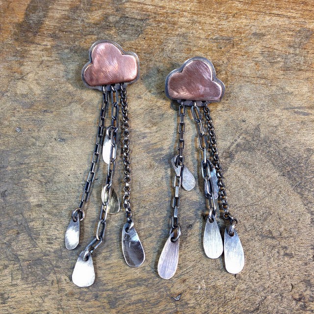
Andrea Ring Raincloud Earrings
~
 
And below are our 2 fabulous Guest submissions!
For this challenge I choose the word Ombré. I wanted to make a gradient using texture instead of color. Entropy is always on my mind. So maybe this is why I was inclined to make a bunch of circles in the beginning and then moving to the right and dispersing off into the universe.

Copper, Sterling silver, enamel, Larimar, Aventurina.
~
 
NEXT WEEK!

Episode 2: 
"Unconventional Movie Challenge"

 "Project Runway" Season 13, Episode 2  Air Date: 07/31/14.
In this episode, the designers' challenge was to create a look inspired by
"Things you would find in a movie making & movie watching!"

So for our team challenge we are going to define it and use the same materials the designers used for their runway creations, or you can use the show's theme!
Remember this is a Unconventional Materials Challenge, go wild!

Film
Paper
Straws
Tickets
Zip Ties
Letters (font)
Compact Discs (CD's)
~

*guidelines for guest participants*
The pieces you submit must be pieces that are made with intent for that weeks challenge. Then post your  Flickr, FB links (I need to be able to grab the photo) in this weeks comment area below, I will retrieve them as they come in before the deadline.
We will post your name, link, description (you write) and a picture of your piece on this blog. Remember, the rigid deadline for submitting your link is always on Thursdays, 12 midnight, Pacific Standard Time. The new blog posts will go up on Fridays

Friday, August 1, 2014

Charm Swap 14 update.....

Hi Everyone! This week's update's are in and ready to go! Jen from Prox has started working on her charms....She has been sawing away! She sends this photo ans says:
"Sawing lions. 6 down, 16 more to go." ....That's a lot of sawing and they look great Jen!


Laura from Laura Roberson also has some progress for us this week. Laura says: "Here are a few photos of my sterling "glacial pothole" charms in progress. I'm finally done with soldering, which was a little trickier than I thought it would be, and am in the finishing stages.  I think they'll look really cool once they're oxidized and parts are highlighted. It's been a lot of fun making them." ...Laura, I can't wait to see them finished! 


And last but not least we have a photo from Betsy of Betsy Bensen. Betsy is toying with the idea of doing heart charms. "since I seem to be getting multiple requests for heart shaped stone jewelry from customers, I figured why not do a heart charm. Instead of a stone, I wanted to practice my Kuem Boo technique on silver... I'll probably change the shape of this heart somewhat, and use 16 gage sterling, and figure out a simpler design for the 24kt applique. And to oxidize or not to oxidize, I like it either way actually... All I know is that I'd better get my act in gear, Sept is just around the corner!"...You are correct Betsy! Sept is closer than we thing! I need to get my act together as well!


Well that's all for this week. Until next time! ~MIchele

Thursday, July 31, 2014

Etsy Metal 3xR Challenge Week 29

Hmm, was there a memo going round that I missed?  Did someone post something about incorporating the colour red into our 3xR pieces for this week?  Well, if they did, I missed it and if not, then we are one tight bunch of super tuned in fabulous metal artists! Can't wait to see what we all mystically and magically manage to morph together next week.

1. SCJ Jewelry Design 2. Virginie Martin Studio 3. Renee Ford

Members" News for the month of August

Hello blog readers!  I am here to report on our activities for the month of August.

L. Sue Szabo's work Strange Fruit was shown in the Toledo newspaper The Blade on 7/10/14.
See the article here-
http://www.toledoblade.com/Peach-Weeken ... -show.html
Sue also just won Best of Show at the University of Toledo's Art on the Mall July 27th.

 A project that several EM members have contributed pieces to called "A Hundred for One" is gaining some press. The chain was created from donations of links from jewelers and metalsmiths from all over the world as a fundraising tool for CERF+ (Craft Emergency Relief Fund).
Read more about this project by clicking on this link-
http://www.jckonline.com/2014/07/08/lin ... ce-charity

 You can follow the journey the chain is on by liking the Facebook page here: https://www.facebook.com/pages/A-Hundre ... 2380747467 or the website here: http://www.ahundredforone.com/home.html

Stay tuned as Renee Ford will be writing a full blog article on this project in the second week of August.

LjBjewelry will be selling her art jewelry at three different art shows in the moth of August. The first show is By the Bay Art and Craft Show, Aug 1-3 at Drummer Boy Park in Brewster Ma. She will also be attending the 43rd Art Festival in Chase Park in Chatham Ma, August 15-17. The last show is organized by the Artisan's Guild of Cape Cod at the West Barnstable Community Building in Barnstable Ma, August 30-31. If you are in the area come by and say hello!!

Til next month, enjoy your summer.
Sue Szabo

Saturday, July 26, 2014

What's New!


This is what's new in the world of etsymetal this week!

 KSkilesJewelry                                                  AmityJewelry


 2Roses                                                      Panicmama Jewelry


 lsueszabo                                                     SCJJewelryDesign


 Prox                                                                      Amuckdesign


 simplyMegA                                             Nina Gibson Designs


 LjBjewelry                                                              LivelyHood


VirginieMartinStudio                                      Art By Winona


Victoria Takahashi                                   JewelryByFrancine


Peggie Calame Jewelry                                      bluepiranha


Related Posts Widget for Blogs by LinkWithin
 
>