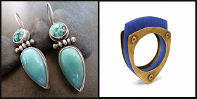
Whether you add color using gemstones, found objects, enamel, or flame painting, the colors you work with can help grab attention just as much or more than an amazing sparkling diamond.
Color is one of the most impactful visual techniques that can be used in the design of an object. Color is visceral, emotional, psychological and symbolic. Like our sense of smell, color is directly linked to memory, and just a glimpse of a color you like or dislike can subliminally make your decision about whether to ignore it, touch it, desire it or buy it.
Those (like me) who work as visual designers know how powerful color is. We use it when we design packaging, advertising, logos, websites and product design. And because color effects your brain on its own with no conscious help from you - the colors you see do lots of things to your brain that you might not be aware of.
Choosing colors is important not only for the work we make as artists, but also for our visual identities (our brands), what we use to package our items and even the text colors we use in our newsletters, emails and other correspondence to our customers.
So lets learn about some popular colors and see what's behind them - other than their obvious attractive hues.
 |
lsueszabo / CynthiaDelGiudice |
Lets look at red first.
Steeped in history the primary color red symbolizes many things. Red means power. Red means life. Red means passion and love, but ironically, also fear and anger. Seeing red stimulates the adrenal glands and tells your brain that its time to pay attention because it might be time to move.Red is the most aggressive of colors, it grabs our attention and can easily be overwhelming. But because red is also the color that most stimulates our senses it therefore can be used effectively to entice someone to do something… STOP for instance. And it can grab the attention of a buyer and draw people in for a closer look. And if you have ever suddenly felt hungry and didn't know why - look around you… red is widely used in the food industry to make people hungry - and unfortunately crave foods that might not be good for us.
 |
MicheleGradyDesigns / markasky |
Sunny Yellow
Who can see the color yellow and not think of the sun? This color just exudes brightness, sun-shiny happiness and warmth. Like red it is another attention grabbing, high visibility color, often used for signage on the road and in storefronts. When we see bright yellow we instantly pay attention, it is a commanding color that is very hard to ignore. In fact it is the color that attracts our attention more than any other. (which is why school buses and warning signs happen to be yellow) When we view softer, richer, golden colors we often feel comforted and warm.
 |
fentondesign / mkwind |
Heavenly Blue
If you have ever gazed upwards you can imagine why blue is a color that has been used throughout history to represent the heavens and the skyworld. Because of that connection it is widely associated with religion and also superstition. It is believed to be a protective color, and is still often used for talismans. Here in the northeast United States where I am from many people paint the ceiling of their farmers porches blue… it keeps away witches they say. But blue is contradictory in some ways too. It can mean quality and skill - think "Blue Ribbon" but also sadness and depression as in "having the blues". In the corporate world dark blues are used often as it immediately shows conservative dependability, seriousness, high quality and high achievement. Lighter blues are often used to evoke calm and peace. Fun fact - blue is one of the only colors that dogs see vividly.
 |
2Roses / hybridhandmade |
The Lushness of Green
Green is one of those colors that is just immediately associated with the outside world. I wrote an entire blog post about green, and how the definition has changed recently to mean "eco-friendly" and while that can't be ignored I'm going to focus on the original connotations. There is so much green out there - beyond your windows - green is just simply one of the most natural colors there is. It is also the most soothing color to our eyes. Green tells our brain that something is natural, lush, fresh and clean. It represents emergence, regeneration, and health. Green just feels "good for you" - ask any kid with peas or spinach on their plates to confirm that one.
Of course there are millions of colors that fall into and out of the above categories. Purples, oranges, earth tones, neons, and pastels… they are really endless. This is just a start.
Whether you care about color meanings or just want to design a piece around a sparkling gem that you love, experimenting with color in your work can be fun, and can certainly grab the attention of gallery shoppers if you use it well.
Resources to learn more:
COLOR: Messages and meanings - Leatrice EisemanCOLORS: What they mean and how to make them - Anne Varichon
Guide to Communicating with color - Leatrice Eiseman

1 comment:
Well, a really put together post - I enjoyed reading about the power of color. It would be nice to break that down even further...such as an artist would used (i.e. green) in their work because they wanted their client to feel more connected to her work. But I see this is the first of two so who knows what will come next.
Post a Comment